Checkout Redesign
Removing friction and improving checkout rates

Goals
Increase checkout to order conversion rate as we move to a new scalable technology, while improving the user experience
Product Designer
User Experience
Information architecture
Interactions
Visual design
User research
Summary
In 2017, SurveyMonkey underwent a Brand Refresh - a push to revamp the Brand, correct flows, and improve the technology we were built on. On my entry into SurveyMonkey, I was tasked with redesigning the Checkout page, a page that was not touched for over 4 years and data that pointed to much-needed improvement.
The goal was to reduce any friction users were having during the purchase process, making it an easy and smooth transaction into the beginning of a long-standing relationship with the SurveyMonkey product. As a result, this would increase our Checkout-to-Order conversion rates and gain back business we were currently losing by not allowing our users to easily and quickly checkout.
Discovery
To establish a baseline of understanding of checkout, I worked with my Project Manager to run product analysis and I ran usability research studies: uncovering issues of trust, comprehension, and display errors that kept blocking users from completing their purchase.
Previous Checkout Page
(control)
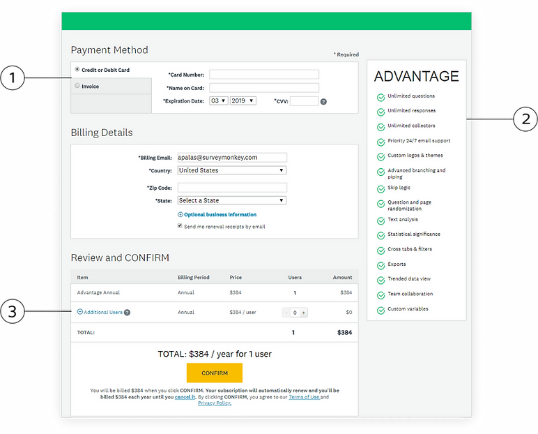
2. Visually the page was functional, but not enjoyable. Also, the misalignment of UI elements did not seem professional and users questioned if this was a SurveyMonkey page versus a false page.
1. Placement of the payment method at the top of our checkout page did not promote trust and users mentioned it seemed “grabby”.
Also payment methods were dependent on the country that the user selected.
3. Confusion around the field and specifications, like purchase order number and adding users to their plan caused buyer hesitation
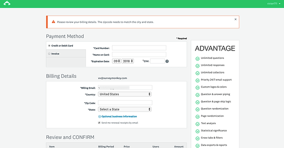
4.Error states were global only, making it hard for users to correct their information.
Users would be automatically scrolled to the top of the page to view the error message and the fields in error were not highlighted.
Approach
Looking at best practices and studying multiple checkout flows, we whittled down to 2 experiments that would test layout and information display. SurveyMonkey supports over 15 countries and our research has shown that multi-step / multi-page checkouts are popular in international markets, we wanted to test this in our 1st hypothesis. For hypothesis 2, we showed all the fields and paired it with a persistent order summary which is generally standard across checkout forms.
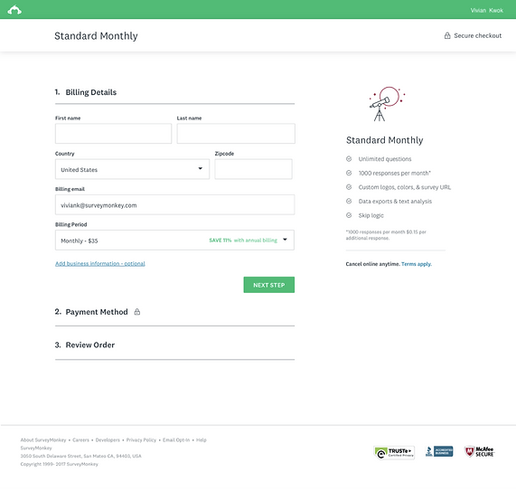
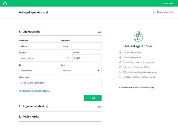
Multi-section checkout
Hypothesis 1
We believe that by breaking down the checkout into steps makes it easier for users to fill out the form in digestible chunks.
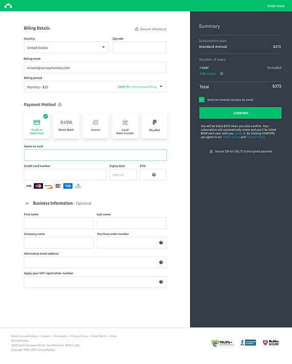
Single page checkout & right order summary
Hypothesis 2
We believe providing a persistent view of the order summary, will promote trust and eliminate pricing confusion.
In addition, we committed to optimizing the experience including:
• Designing for mobile
• Improving errors - Inline validation
• Credit card display - more clarity
• Reducing form fields for different countries
• Pre-populating form fields where appropriate
• Payment method instruction improvements
• Additional tooltips
• Order of sections
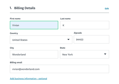
Auto-focus

Improved error states - inline validation
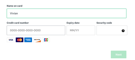
Credit card display

Credit card highlight
The Results
Our hypothesis 1 had a sweeping win, increasing in both the US and our supported countries. For users who entered the checkout funnel there was a 4% US / 8% non-US improvement of Basic to paid users in the new design over the control.
+4% conversion increase
U.S. increase in improvement of Basic to Paid (B2P) rate in the test v. Control
+8% conversion increase
Non. U.S. increase in improvement of Basic to Paid (B2P) rate in the test v. Control

Next steps
The checkout experiment was successful for creating a base framework for our checkout across all the locales that we support. Variation 1 was implemented into the product and we continued to define optimizations to the checkout flow as well as opportunities to highlight value to our users. We ran additional tests like adding a help widget on checkout, right rail order summary, and visual changes so that users could easily choose a monthly or an annual plan.